Creative Typography in Publishing: Global Perspectives and Practical Lessons
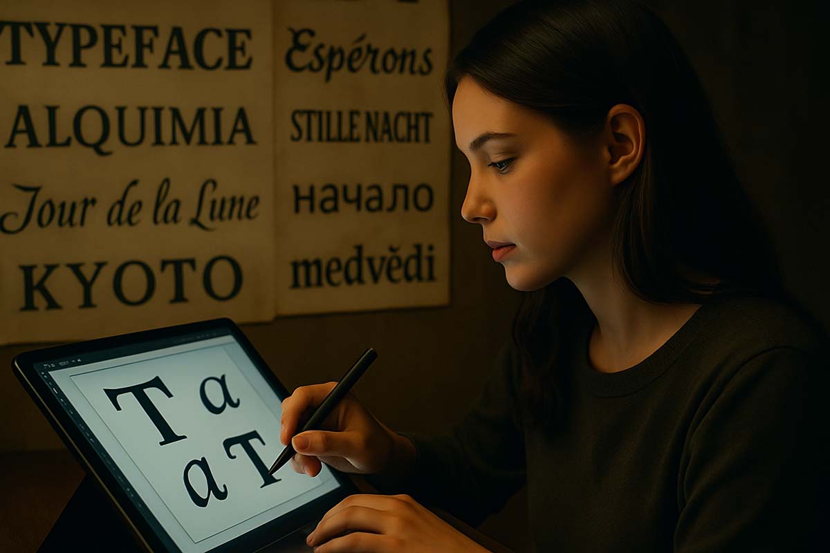
Typography is no longer just about choosing fonts. In recent years, it has become a way to bring energy, personality, and movement into text. From Berlin’s edgy zines to Tokyo’s manga layouts, design communities around the globe are shaping typography into an expressive tool that pushes beyond conventional structure. It’s not just about how words look anymore—it’s how they feel, how they guide the eye, and how they shape emotion.
With both traditional print and digital formats coexisting today, designers are finding new ways to hold readers’ attention. Through fresh visual techniques and bold experiments in layout and motion, typography has grown into a powerful way to enhance storytelling. Whether you’re a writer, artist, or developer, understanding these global trends offers useful ideas for making your own content more meaningful and memorable.
At a Glance
• Modern typography steps beyond rigid structure to reflect the emotional tone of the message.
• Cultural inspirations—from Latin American street art to Japanese manga—reveal how type can carry deeper meanings.
• Whether in print or online, clarity and accessibility remain vital alongside creative expression.
A Short Timeline of Typographic Experimentation
Typography started to break away from tradition during the early 20th century. The Futurist movement in Italy and Bauhaus design school in Germany sparked this shift. Designers like Filippo T. Marinetti and László Moholy-Nagy believed typography could be more than just a neutral frame—it could lead the reader through emotion, movement, and rhythm. Pages became playgrounds, where letters danced and broke free from expected order.
In the 1980s, Neville Brody revolutionized British magazine design through The Face, where jagged lines and unusual text alignments reflected a youth culture in search of change. Across the world, manga artists in Japan introduced layouts where vertical and horizontal writing collided to build tension. Typography became a silent character, guiding readers through plot twists and emotional beats.
Meanwhile, during economic crises in Latin America, groups known as cartoneras began publishing books with hand-painted covers on recycled cardboard. They transformed affordability into an art form. These efforts proved typography could also serve as a tool for activism, local identity, and cultural pride.
Design in a World of Scrolls and Screens
As more people consume content on phones, tablets, and laptops, typography has adapted. Clean layouts and proper spacing are no longer enough to keep someone from clicking away. Interactive design has stepped in, blending movement and responsiveness with text to hold attention.
Emerging Digital Features
Many news sites now animate words based on scroll speed or user input. Some magazine articles trigger changes in font weight or spacing as the reader moves through sections. These features help emphasize emotional pacing or urgency.
In art schools across the United States, typography is now part of coding classes. Students learn how to design fonts that respond to user behavior, screen size, or even time of day. This mix of aesthetics and logic gives typography an entirely new layer of flexibility.
But even the most advanced designs still need to be readable. Accessibility testing now includes screen-reader compatibility, color contrast checks, and guidelines to support readers with different needs. Designers are learning that great typography doesn’t just look good—it has to work for everyone.
Popular Techniques in Global Typography
Across continents, experimental typography is gaining momentum. Whether it’s in digital campaigns, physical installations, or art books, creators are discovering new ways to merge form and function. Three techniques stand out for their creative value and real-world impact.
- Variable Fonts – These font files allow users to choose any weight or width between extremes, creating seamless visual transitions. Instead of switching from regular to bold, designers can use micro-adjustments that respond to device size or user interaction.
- Collage Lettering – Independent zine communities in places like Melbourne and Mexico City often blend multiple typefaces, hand-written elements, and clipped photos. The results resemble jazz or poetry—layered, rhythmic, and rich with texture.
- AR Lettering – Augmented reality allows letters to appear in the real world through a camera lens. In Helsinki, some museums use this to animate text from exhibition guides, making each page feel alive in space.
While these ideas feel exciting, they also come with a set of practical challenges. AR-based layouts must be visible even in dim lighting. Collages need thoughtful color and contrast choices to avoid confusion. No matter how creative the design, ease of reading remains a top priority.
Case Studies: What Works and What Doesn’t
Great typography doesn’t happen by accident. Some of the most admired projects in recent years started with bold decisions—but succeeded because those decisions were backed by research, testing, or thoughtful revision.
Success with Structure
In California, Khoi Vinh and Zuzana Licko worked on redesigning a journal by wrapping headlines around page edges while keeping the body text in a readable, straight format. This playful layout increased average reading time by five minutes—a sign that creativity, when used carefully, can boost user engagement.
When Form Distracts from Function
However, not every experiment turns out well. A publisher in Madrid had to pull back a poetry collection after readers—especially older ones—complained that its elaborate drop caps were too distracting. It shows how crucial it is to balance art with audience comfort.
Design Ethics in Modern Typography
As typography becomes more expressive, it also takes on more responsibility. Some design choices can unintentionally exclude people. For example, a brand in Canada was criticized for using ultra-thin fonts that looked elegant but were nearly invisible to users with vision impairments.
Respect for Culture and Audience
Typography also carries cultural meaning. Mixing sacred scripts like Devanagari or Arabic with bold European styles can lead to controversy if done carelessly. Designers are encouraged to consult native speakers or historians before combining scripts with deep heritage roots.
This kind of care shows respect not just for design traditions, but for readers themselves.
Typography as Education and Empowerment
In many places, typography is becoming part of community learning. Public libraries in cities like Manila, Tokyo, and Johannesburg now offer workshops where teens can create their own fonts using free tools. These programs help young people feel ownership over what they read—and what they create.
In Scandinavian universities, researchers are studying how font features affect memory and comprehension. Early findings suggest that slight increases in white space around headers improve focus. Even small changes in design can lead to better learning outcomes.
Creative Control for the Next Generation
As more young creatives gain access to design tools, typography is becoming part of how they shape their voices. Instead of just consuming content, they’re becoming part of the process—choosing how letters look, how words behave, and how pages flow.
Typography That Speaks with Purpose
Typography is more than decoration. It can signal urgency, calm, excitement, or mystery. Around the world, designers are learning to use type like a brush or an instrument—something that can move, guide, and transform.
When design serves both the eye and the mind, it helps messages land better. And when care is taken to respect accessibility and culture, typography becomes a shared experience, not just a visual one. The lesson here isn’t to design louder—it’s to design with intention.
Whether you’re publishing a book, coding a website, or sharing stories in your community, typography can be a quiet but powerful ally. The details matter. Each letter, each space, each curve can say more than it seems—if you let it.