Using JPG for Visual Art Submissions: A Practical Guide for the Modern Creator
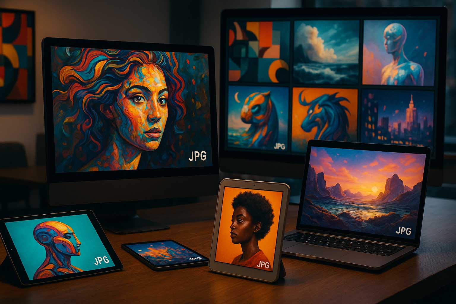
Art continues to thrive online. From virtual galleries to international competitions, digital platforms shape how works are shared and recognized. Among file formats, JPG stands out as the most frequently accepted type. Its compact size, broad software compatibility, and easy sharing make it the go-to for artists submitting work across borders.
Still, preparing images requires more than just saving them correctly. Some venues require specific formats during later stages, so it can be useful to convert JPG to PDF for final submission or archiving. But mastering JPG goes beyond that. Quality, presentation, and technical accuracy all affect how a piece is received globally.
- Balance: JPG manages quality and file size, ideal for fast uploads and previews.
- Settings: Correct resolution, color profile, and bit depth preserve the essence of your work.
- Workflow: From capture to metadata, every step matters in staying true to your vision.
Why JPG Remains the Preferred Format
Introduced in 1992, JPG gained popularity for its ability to reduce image size while keeping visual detail and color intact. For curators and gallery owners, faster loading pages mean smoother user experience—especially when showcasing multiple entries. JPG also works well with nearly every content system, making compatibility issues rare.
Still, artists must stay cautious. Over-compression can lead to blocking or visible color shifts. Too little compression, on the other hand, results in heavy files that load slowly. The key lies in finding the right balance—each piece may need different settings depending on its style and level of detail.
Compression Settings and Their Artistic Impact
JPG uses lossy compression. This means some image data is permanently removed during the process. For hyper-realistic digital art, this can be tricky. Every hair strand or highlight matters. Dropping the quality to 40% on a 300-dpi file might erase subtle gradients or create texture blurs. However, for works focused on abstract textures, 60%–70% often retains artistic intention without major distortion.
To get the best result, export several versions of your piece. Then zoom in at 100% and 200%. This allows you to compare compression levels and decide which one keeps your work intact.
Resolution and Dimension for Global Viewing
Three key factors guide resolution: screen size, exhibit layout, and loading speed. A typical safe size for international calls is 3000 pixels on the longer side (e.g., 3000 × 2100 px). This allows curators to zoom in and see fine details without file lag.
Mobile-first platforms may request smaller sizes, such as 2048 px, to reduce bandwidth strain. This smaller dimension still keeps important strokes and lines visible. Don’t forget about aspect ratios, too. Square, landscape, or panoramic shapes affect how artworks appear in galleries. If your piece is panoramic, create a cropped version for the cover image to avoid cutting off the composition’s focal point.
Metadata Matters More Than You Think
Each JPG can include EXIF and IPTC metadata: title, artist name, creation year, and keywords. When these fields are correctly filled, curators can trace works more easily. Software like Adobe Bridge or XnView allows you to enter these details during export. Including media type and a contact email is also helpful.
Be careful not to include unnecessary information like exact GPS data, especially if privacy is a concern. While digital tools help share your work, protecting your studio location still matters.
Color Accuracy, Gamma, and Visual Clarity
Color inconsistencies often arise because monitors are calibrated differently. What appears as neon green on your screen might look dull or greyish elsewhere. To minimize this risk, always use the sRGB color space when exporting. This is the default setting for most browsers and online platforms.
If you create art using Adobe RGB or ProPhoto RGB, convert it to sRGB before saving. Without this step, your artwork might display in incorrect hues on gallery pages. Adjust the gamma curve if needed, especially when the platform uses dark mode. This avoids shadowing that can hide details in darker portions of the image.
Efficient Workflow from Studio to Submission
Use a consistent process to reduce errors and rework. Here’s a four-step method to streamline your submissions:
Capture or scan your artwork at the highest resolution your tools can support.
Edit the image in professional software—clean dust spots, fix glare, and correct any lens distortion.
Run export tests at different quality levels (e.g., 80%, 70%, 60%) and inspect artifacts at full zoom.
Add metadata and preview the final file on various devices before uploading.
This approach saves time and ensures consistency across different submission platforms.
Submission Standards Around the World
In North America, some juried competitions cap file sizes at 5 MB to speed up reviews. In Europe, 10 MB is often accepted if the image doesn’t exceed 3000 px. In pan-African digital shows, square crops are encouraged to match grid layouts commonly used on social platforms. Fortunately, modern editing tools let you create export presets for each requirement, saving time when switching between calls.
Read each submission guide carefully. If something is unclear, send a quick message to the organizers. Guesswork can lead to disqualification, while early clarification shows professionalism.
Common Mistakes and How to Prevent Them
A checklist can prevent headaches and missed opportunities. Below are frequent issues and quick fixes:
Excessive Compression: Start with 80%, then adjust downward while checking detail loss.
Wrong Aspect Ratio for Previews: Prepare a separate crop for cover thumbnails.
Empty Metadata Fields: Use a batch editor to automate IPTC data entry.
Color Shifts on Browsers: Proof the file in sRGB and open it in two different browsers to verify.
Saving in CMYK: This is meant for printing. Use RGB for digital formats like JPG.
Distracting Watermarks: Make them minimal and avoid covering key elements.
Each step may seem small, but they all contribute to how your work is perceived and remembered.
Real-World Examples from Different Regions
A digital artist from São Paulo submitted a high-range portrait to a pan-American exhibit. By using sRGB and keeping the quality at 80%, the piece displayed smoothly even on low-bandwidth networks.
In Berlin, a photographer scanned a black-and-white negative at 300 dpi, then exported at 70% quality. The result? Sharp enough to be featured on the event’s 4K display wall.
Meanwhile in Nairobi, a collective submitted mixed-media works cropped to 2048 px as per local requirements. They included team bios and Instagram handles in the IPTC fields. This helped them connect with curators and led to a group residency in Amsterdam. It all started with a carefully prepared JPG.
Preserving Image Quality During Sharing
Social platforms often compress images again after upload. If you download and repost the same file, quality drops each time. To avoid this, always keep a master copy in TIFF or PSD. Export fresh JPGs per submission, rather than reusing compressed versions.
As for watermarking, think like a curator. Ask whether the mark adds recognition or distracts. Use semi-transparent overlays and place them away from focal points. This keeps the image professional and respectful of the viewer’s experience.
Maintaining Quality Without Compromise
When your JPG is carefully prepared—from its dimensions and color settings to the metadata—the message of your art becomes clear and accessible. Through a structured approach and consistent review process, your piece stays vibrant, detailed, and ready to reach new audiences around the world.