Why Hand-Lettering Still Matters in Visual Work
Hand-lettering gives a unique personality to any design project. With the abundance of digital fonts, handwritten text instantly draws the eye and builds a personal bond. It stands apart. Whether you’re shaping a brand, creating a product label, or crafting a social media post, this method shows thought and emotion.
It does more than decorate—it expresses a voice. Hand-drawn letters have a soul that mass-produced typefaces can’t imitate. This approach works well for those who want to present something more personal and heartfelt, such as local entrepreneurs, artists, and small businesses.
A Brief Background on Lettering Traditions
Lettering has always played a vital role in communication. Ancient civilizations carved symbols into stone and bone to pass on ideas. Across Asia, brush lettering evolved as both written language and expressive art. In medieval Europe, scribes added gold leaf to ornate letters that introduced each chapter of sacred texts.
During the mid-20th century, hand-lettering made a strong comeback. Storefronts and street signs used painted type that captured the spirit of a neighborhood. Album covers, posters, and packaging during this time also embraced bold, handcrafted text. As digital tools emerged, interest in lettering waned—yet it never disappeared. Many designers kept the skill alive. Today, more people are turning back to handmade visuals to give their work depth and warmth.
Understanding the Main Styles of Lettering
Each style of hand-lettering conveys a distinct emotion. A few of the most common include:
Serif Lettering – Recognized by its small lines or feet at the ends of letters. It feels classic and trustworthy.
Sans-Serif – Sleek and minimal. It works for modern designs that aim to be clean and direct.
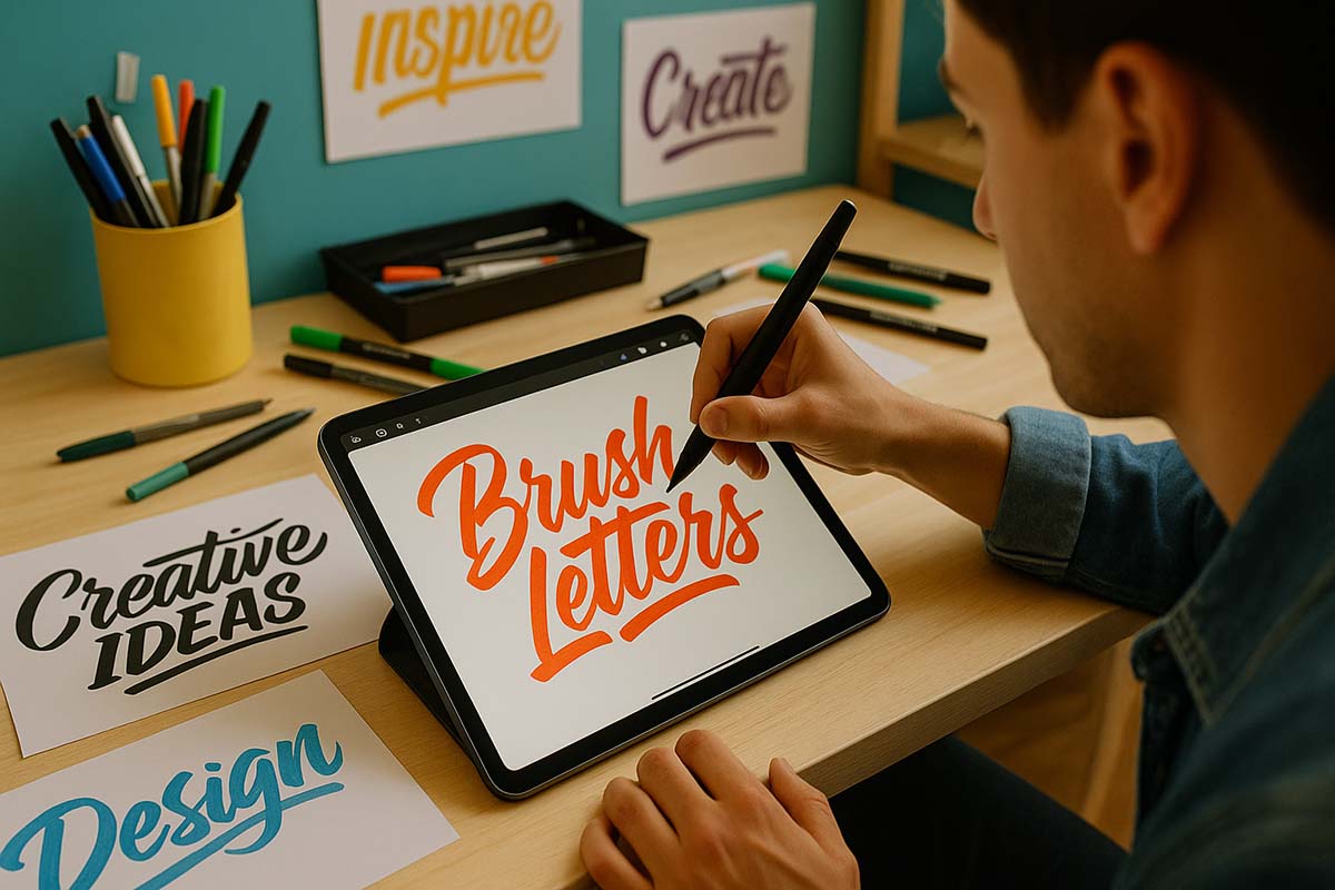
Brush Lettering – Features thick and thin strokes created by pressure-sensitive pens or brushes.
Modern Calligraphy – More fluid and expressive, often mixing angles, curves, and spacing.
Practicing these styles helps build control. Focus on repeating simple strokes—up, down, and curve. Over time, the hand adjusts, and movements become natural.
Using Hand-Lettering in Design Fields
Lettering fits into many creative spaces. On Instagram, a hand-lettered quote can set a post apart. In branding, it gives a logo that handcrafted feel. Restaurants use it on chalkboards to add charm to menus. Coffee shops paint their windows with flowing script to invite passersby.
Wedding invites, thank-you cards, book covers, tote bags, and more use this method to show intention and style. A fashion boutique might hand-letter its price tags to add a touch of care. A handmade soap brand may use it for packaging to reflect its craft-based identity.
Case Studies and Global Examples
In Brazil, a café chose hand-lettered signage for their storefront. The design was simple but warm. Soon, photos of it appeared across local blogs and social media. This led to more customers visiting, drawn in by the cozy, welcoming feel.
Meanwhile in Portland, Oregon, a bakery used hand-chalked menu boards. Tourists found them charming and took photos. These visuals made their way to travel websites, helping the small shop gain attention it couldn’t have bought with ads.
In South Korea, specialty tea brands use hand-lettered labels. The aesthetic speaks of tradition, care, and detail. For a market saturated with mass production, it’s a powerful way to signal authenticity.
Tools and Materials for Beginners
Getting started doesn’t require expensive tools. The following are excellent for first-time artists:
Pencil – Good for sketching outlines.
Eraser – Helps refine shapes and remove grid lines later.
Fineliner Pens – Offer sharp, precise strokes.
Brush Pens – Allow dynamic thick-to-thin variation.
Ruler – Useful for alignment and even spacing.
Paper choice matters. Smooth surfaces work best. Textured paper can make it hard to control the pen. Matte finishes also reduce ink bleeding. For digital approaches, a tablet and stylus can simulate the experience, though many artists still prefer the tactile feel of ink and paper.
Step-by-Step Process to Build Skill
- Create Grid Lines
Use a ruler and pencil to draw faint horizontal lines. These serve as guides for height and baseline. - Sketch the Letters
Draw lightly. Keep the form loose and balanced. Adjust spacing before committing. - Add Ink with Care
Use your pen to trace over each character. Apply pressure slowly to vary the line. - Let It Dry
Avoid smudging. Wait until the ink sets before moving to the next step. - Remove Pencil Marks
Use a soft eraser. Don’t rush. This keeps the piece clean. - Add Decorative Touches
Lines, stars, dots, and shadows all help elevate the final result. - Digitize If Needed
Scan your work to share online or refine digitally. Free editing apps help adjust contrast and remove errors.
Building Habits and Staying Inspired
To grow, consistency is key. Try short warm-up drills daily. Even ten minutes of practice sharpens the eye and steadies the hand. Choose a phrase to letter and explore it in multiple styles. Then review what worked and what didn’t.
Join lettering communities online. Feedback from others helps identify patterns and improve your form. Watch time-lapse videos to see how experienced artists work. But keep your voice. Style grows from repetition and experimentation—not copying.
Books and courses can also help. Libraries often have design sections full of helpful guides. Some platforms offer free lessons. Find one that matches your pace and interests.
Hand-Lettering for Branding and Marketing
Design matters in perception. A hand-lettered sign on a farmer’s market stand communicates freshness and tradition. It’s not just about aesthetics—it reflects values. People respond to visual storytelling.
Many brands now include lettering as part of their identity system. It appears in logos, social media templates, and promotional graphics. The consistency of style builds recognition.
Events also benefit. A music festival might hand-letter its stage signs or wristbands. A skincare brand might use the same lettering across packaging and social posts. Each time someone sees it, they link it to your message.
Emotional Value of Handwritten Design
At its core, this form of design feels human. In every stroke, there’s intention. Mistakes become texture. Variations add charm. A computer can replicate a font perfectly, but it cannot recreate the feeling of a wobbly, well-loved sign made by hand.
In uncertain times, people turn to things that feel honest and crafted. That’s why hand-lettering has found its place again. It doesn’t shout. It speaks. And in design, that’s often what matters most.
The art of hand-lettering continues to evolve. While trends may come and go, the desire for visual warmth remains strong. Designers who invest in these skills not only expand their creative toolbox but also connect more deeply with those who see their work.
It doesn’t require perfection. Just presence. And a willingness to put care into each letter drawn.